My Etsy Shop

Thursday, April 27, 2017

One Room Challenge - Furniture


Welcome back, Friends.  If you've been following other bloggers who are participating in the One Room Challenge, you may be feeling some rising anxiety as the weeks go by.  That is certainly the case here at RM Design/Renaissance Mermaid!  There are still projects to complete and details to button up, and the time seems to be going faster and faster...
At any rate, today is all about the larger furniture pieces.  I want to show you the "anchors" for the design of our Master Bedroom.  My vision for this space began with masculine vibes and simple, but interesting, shapes.  The first piece I culled from my hours upon hours of internet shopping was this timeless dresser, which we will be using as a TV stand.


Chairish is one of my go-to sources when I want something unique.  Because this piece is used, it isn't in pristine condition, but I'm fine with that.  The clean, straight lines and bold brass hardware will always have a place in my home.  I like to select pieces that can easily transition to other rooms and uses in the future.  We'll probably store seasonal bed linens in the drawers, although my hubby has hinted at wanting to use them for some of his clothes...(to be determined, haha.) 

Next, this chest absolutely took my breath away!  The shape and details were exactly what I wanted, but I did deliberate for a bit because of the price - I needed to order two, as these would be used as nightstands.  In the end, though, I just couldn't get this beauty out of my mind and decided that the splurge would be worth it.

These pieces have a British Colonial/Plantation feel to me, and the finish on them is gorgeous.  They are quite a bit larger than the conventional nightstands we had here previously; but we have the space and, again, these will transition nicely into our next home someday.  Plus, I tend to pile lots of books on my side of the bed, so this will give me plenty of room to keep my collections organized.  There is a lot of space within the drawers as well, so we can't possibly complain about a lack of storage space! 


Soho Upholstered Iron Bed by Largo Furniture

The headboard I selected definitely has a personality all its own.  It's industrial and very masculine, but some folks might question this design decision.  My thought process was to find something heavier than our previous headboard which was a bit insubstantial, and also something that was more comfortable to lean against.  (You can see our old headboard here.)  I knew I didn't want a completely upholstered one, nor did I want a strictly metal one.  This headboard seemed to check all of the boxes for me, with the added bonus of having a dash of antique brass on the finish.
Finally, I wanted to have a table next to the leather chair, which we brought into this room from my husband's office.  I think the corner where the chair sits could be a really comfortable reading spot with the right set-up.  I usually read in bed, but that's not always ideal because it's a little hard to sit up straight, and I also have the tendency to fall asleep!  Our bedroom is by far the warmest room in the house, so during the winter months I spend a lot of time in here.  And the nook that I'm creating sits by the window, so it's a perfect place to relax.  There is a cute shop in our city that sells mostly mid-century modern furniture.  I snagged this great table for a really reasonable price.  It was probably used as a coffee table before I got ahold of it and might be slightly large for a side table, but it should work well to hold books, magazines, a beverage, etc. 
 
My current plan is to paint the wood a gloss white, but I'm still contemplating that.  With dark paint and furnishings in this room, pops of white will help keep things from getting too weighty and somber.  The rods you see on the table are brass with lion head detail, and there are small brass medallion details on the base.  Of course, I will preserve all of this brass!  This is one of the projects yet to be completed in the next couple of weeks, and I'm asking myself if I've gone mad, haha.  I am NOT a fast worker...in fact I employ an "artistically" slow, puttering style, so it remains to be seen if I can pull this off! 
Also, the accessorizing of the room, which should be the fun part, is causing me to pull my hair out!  Finding just the right mirror, arranging and installing a collage wall, and hunting down the perfect tchotchkes is anything but fun right now, lol.  But I hope you'll stop back next week when I'll show you how I'm prettying-up this room.
Thanks for following along with my progress.
Julie


Sharing with:  Calling it Home, Vintage Charm

Wednesday, April 19, 2017

One Room Challenge - Out with the Old

Welcome back, Friends!  Thanks for stopping by to check on my One Room Challenge progress.  I hope you've been able to visit some of the other featured and guest bloggers who are busy working on their room transformations.  There are some really amazing projects happening out there!  And I'd love to thank Linda from Calling It Home for creating, organizing, and hosting this twice-yearly Challenge!
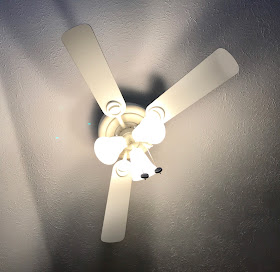
As promised, I'm first going to share the funny story I mentioned last time.  OK, please take a look at the photo of the ceiling fan/light below.........does anything look strange about it?


It originally had 5 blades!  If you remember, I had mentioned that I was questioning the need to replace that fixture for this challenge.  My hubby really enjoys having a fan in the bedroom.  Also, though, let me note here that our greyhound is deathly afraid of ceiling fans.  Weird, I know.  He is a rescue racer, so we think there may have been loud fans in the kennels where the hounds were boarded, but that's just our theory.  At any rate, we don't run the fans in the house because it causes him so much anxiety!  So, that could have been reason enough to replace this fixture.  However, a couple of months ago we noticed that one of the blades seemed to be hanging a little lower than the others.  After inspection, we could see that the metal piece that attaches the blade to the fan had been broken, so it was connected precariously at that point. My hubby then remembered having heard a "pop" sound when he last dusted the fan, so we figured he had accidentally broken it.  He took blade #1 off of the fan.  Well, as if that wasn't enough to convince me to start shopping for a new light....

While we were dog-sitting our daughter and son-in-law's greyhound, Cougar, (yes, we both have greyhounds and they look like they could be siblings, haha) she was on the foot of our bed one night as we had settled in to watch some tv.  She is quite the little diva and pretty much commands the household when she is here, claiming her position at the foot of our bed.  As I said, we were relaxing in bed when, all of a sudden, another one of the fan blades abruptly came crashing down on her.  She bolted upright in terror; and once I figured out what had happened, I just started laughing hysterically.  Poor dog...she really got a rude awakening that night!  But it was clear that we would be getting a pretty new light for our bedroom :)  And here it is...


I wanted something that was decorative but not too fussy.  The new headboard for this room has an industrial look, and the other furniture pieces are black with a somewhat masculine feel.  We don't use the overhead lighting a lot, so it was really more about "form over function."  I had several fixtures chosen, but budget did play into my final decision (boo, hiss, budgets!)  I selected the West Elm Mobile Chandelier in a combination Antique Bronze and Antique Brass finish, which was reasonably-priced and fit my vision for the room.  It is going to look really great with the new furniture.
Below, is what it looks like in the freshly painted room.  I am so pleased with this paint color, too!  It's called Spanish Parador from Clark and Kensington.  It is a very muted mocha-color with just enough of a plum cast to give it personality.  Paint colors can be so difficult, right?  I was looking for a "dirty" plum, and I think I nailed it with this one!  It envelopes the room in moodiness, but it also creates a great background for pops of color.


Here, you can see that I am gradually gathering art and pillow covers for this project, which are sitting on that leather chair.  The plants went out to the sun porch this weekend, where they will stay until about October...keeping houseplants alive and healthy is always a juggling act since we have brutal winters here in Nebraska.  They do so much better out on the porch with some humidity.  But during the winter months, we have to bring all of them inside.


And, finally, here are the window shades I selected to replace those outdated vinyl vertical blinds.  They are Hunter Douglas Provenance Woven Woods in fabric, Aspen, and color, Fireside Retreat.  I chose to order them without any black-out lining, so they filter the light but don't block it.  I had to make sure that the hubs was ok with that.  He prefers to sleep in a dark room, and I like having a little light coming in.  But he said that he didn't care, so I hastily ordered before he could change his mind ;)  Our neighbors' house is pretty close to ours, but their windows aren't placed directly across from ours.  If it ever becomes a problem, though, we can always add some simple pull shades behind these, but I don't think we'll have to resort to that.  I also opted to order the shades without valances, which gives them a straight, clean look.  The goal was simplicity and lots of texture, which was achieved perfectly with these shades. 


Here is a sneak peek at a painting project that is going on for this room. Right now, I'm frantically trying to put together all of the accessories, bedding, and art.  I hope you'll stop back next week to see our new furniture pieces.  The weeks are flying by! 

Julie


Sharing with:  Calling It Home, Vintage Charm, Between Naps on the Porch

Thursday, April 13, 2017

One Room Challenge - The "Before"

I hope you were able to take a look at my previous post, which shows the vision of how our Master Bedroom will look at the end of this challenge.  There is a lot of work necessary to complete this transformation from ugly duckling to swan!  Before any progress can be made in this room, the first order of business is to remove the monster treadmill, take the very dated window treatments down, and repaint the ceiling.

Does anyone else buy exercise equipment with all of the best intentions, use it a few times, and then discover that it has become an extremely expensive, dust-gathering piece of sculpture in your room?  I never really wanted that treadmill in the bedroom, but I figured that if it meant the hubby would get healthier, I could suck it up and live with a visually clunky piece of "décor."  As it turns out, our son used it like crazy...for a while - so much so that the friction singed a little area on the carpet (yikes!)  Eventually, though, everyone lost interest or got too busy and it became a piece of "art."  Once the man cave in our basement was finally painted and re-carpeted, the guys agreed to move it downstairs - yea!  And I was celebrating small victory #1.


Before the room could be painted, we also had to remove the circa-1993 vertical blinds.  Seriously, can you believe we still had those in our bedroom?  The thing is, though, they are really functional.  You can control exactly the amount of light you want in the room, they open/close easily, and the vinyl (yes, we had the "stylish" vinyl ones) required minimal cleaning. But, their time had definitely passed, so they came down...hooray!


We needed to paint the ceiling because there were a couple of hairline cracks along the angled slope that had to be filled, and of course the spackle was whiter than the ceiling.  Can I just mention that this simple part of the room redo stalled the project for months?  (Remember, I was planning this room refresh over a year ago.)  We just couldn't bring ourselves to tackle another ceiling, after having done several in our rental properties.  Ugh.  But, finally, we had to face it, and it was a good reason to get a fresh coat up there.  A fun color, other than white, would have been more creative...sigh.  But to avoid giving my hubby a design-induced stroke (haha) I stayed with the conventional white.  Actually, the paint color I have chosen is quite dark, too, so the white ceilings help to keep the room feeling open.  Here are a couple of photos of my favorite painter.  He's a trooper, right?


I was questioning whether I should replace the ceiling fan/light or not.  I really, really wanted a pretty new light there, but my rational thoughts and frugal instincts were kicking in, until.....................ok, I'm going to keep you in suspense.  Please join me next week for a funny story about this fan!


  This entertainment unit and console table that I use as a make-up table are headed out the door.  They are both in good shape, but the style just doesn't work for me anymore.  Also, note how the orange cast of the furniture emphasizes the turquoise paint even more.  I'm not exactly sure what I had in mind when I chose that color.  But more on that subject in weeks to come.  I plan to donate the entertainment unit and either sell or donate the table.  Another decision to be made is whether to replace the table, or to retrain myself to apply makeup in the bathroom.  I'd love to eliminate this piece of furniture and create a large gallery wall in its place - one that extends almost to the floor.  So, I'll be checking into wall-mount magnifying mirrors for our bathroom and will probably opt for a pretty design over function on this wall.


This headboard and these nightstands have also lost their appeal.  The headboard will be sold, but the nightstands and lamps can be used in our guest bedroom.  Our son is using that room temporarily, but these pieces will work well for additional storage.  (Both adult kids still have quite a bit of their stuff here at home, so I'm always looking for nooks and crannies where their high school memorabilia, etc. can be stored out of sight.)  I do still like these lamps - they were purchased inexpensively at Target several years ago.


And now, I'll leave you all with this photo of our daughter and son-in-law's greyhound relaxing in the "old" turquoise bedroom.  You can see that she was not too concerned with the frightful state of our décor.   As a "teaser" for my next post, let me just mention that she plays a part in the aforementioned ceiling fan story, as well.

See you next week!
Julie

Thursday, April 6, 2017

One Room Challenge - Plum Perfect!

There's nothing quite like the One Room Challenge to light a fire under a project, right?  For several years now, I've been a faithful cheerleader and spectator, watching from the sidelines as designers and diy-ers have transformed "before" spaces into beautiful "afters" - all within 6 weeks!

Well, Friends, it's time for this lady to jump in, feet first, and revamp our very needy master bedroom.  If you are visiting my humble blog for the first time, "Welcome" and thanks for dropping by!  I'm Julie, a former Interior Designer, whose passion has always been creating beauty around me.  I appreciate so many design styles and love to blend them into my rooms - our décor is constantly changing and evolving.

However, I have to confess that I have never truly completed a master bedroom in any of our homes, and we've been married for almost 34 years!  It's the room that always got put on the back burner, probably because it's not a public space and guests rarely ever see it.  But doesn't everyone deserve a beautiful bedroom to relax in?  I certainly think so!

Since the bedroom functions differently for so many of us, it's one of the most personal rooms to design and decorate.  We use ours for sleeping, of course, but also for watching tv, reading, and relaxing, especially during the winter months because it is the warmest room in our home.  My hubby and I have slightly differing opinions on things like window coverings, lighting, and storage, but he almost always concedes to my preferences.  That being said, I do shy away from anything too feminine in shared spaces, because it's important for all family members to feel comfortable in their own homes.


Many moons ago, I created a vision board for our bedroom (here) with the intention of starting the project at that time - over a year ago!  Since then, I've incorporated that blue and green color scheme into our living and hearth rooms, so it seemed best to change the palette for the bedroom.  Some of the original choices remain, like the window shades, headboard, and the overall feel of the design.  But I moved toward one of my long-time favorite hues and created a plan based on plum, with raspberry, gold, and, of course, black, which is a mainstay for me.  The large square of plum-mocha on the above board will be our paint color, and the art piece with circles in shades of plums and pinks is the jumping off point for accessories.

The goal is to create a moody, comfortable atmosphere with both masculine and feminine elements, and a hint of sparkle ;)  Furnishings, lighting, and window treatments are straight-lined, transitional in style, and neutral in color; but I'm adding a bit of glamour with small details such as the mini period painting in a lavender frame and the shiny brass lampshades.  A gallery wall will incorporate traditional and modern art, a few vintage pieces, and pops of color.  I'm still working on selecting all of the finishing touches, which is why this vision board is lean on accessory pieces, bedding, and art. 

The project is a cosmetic facelift as opposed to a remodel, but a whole new look was non-negotiable for me.  If I'm finally going to finish our master bedroom, I don't want to simply put a band-aid on it.  The "kicker" when I presented this idea to the hubby was telling him that pretty much everything was going, with the exception of the carpet and a leather chair that will be moved from his office to our bedroom.  Luckily, though, he has learned to live with the idea of frequent change in design and decor around this house!
So, during the next several weeks I hope you'll join me as I post an update each Thursday.  Next week, I'll be sharing the dreadful "before" photos and will get started on removing furnishings and painting the room in this gorgeous, subtle shade of plum. Wish me luck!

Julie