I'm teaming up with Chairish.com again to create another style board, using a few of the great pieces that are currently available on their site. If you would like to read about Chairish and view my previous style board, you can find it here: Discovering Chairish.
This time, I was asked to create a design scheme based on an accent chair (see selection here), and to take a room from white to bright. My inspiration began with these Bergere chairs, because a bright pop of orange can be so playful! The French styling is very transitional, in my opinion, and is mixable with many other styles.
I next selected the Peacock Garden painting with its orange tie-in to the chairs and gorgeous teals and blues. (Orange and blue are complementary colors on the color wheel, so this makes for a nice balance.) From there, I went "shopping" to build my virtual room. I envision these pieces in a space with moody paint (deep blue?) and rich woods. The dramatic black sideboard is one of my signatures...if you read my blog, you know how important I consider black in design. The Turkish rug is an overdyed beauty which incorporates the teal color in a luxurious, textural way.
Making a statement with Asian influence is the lotus brass chandelier and ornate mirror. For accessories, I found a contemporary figure drawing (to keep the scheme from feeling too heavily-traditional) and a brass mask to echo the faces in the drawing. The lamp is lucite, which provides a visually lightweight, sleek feel with a black shade, which relates to the sideboard. Pillows, vibrant coral, and a Chinese ceramic blue and white planter complete the look. If I were designing this room in "real life", I'd add some beautiful books and fresh flowers, pulling tones from the artwork (think orange, magenta, plum....)
The possibilities for creating stunning rooms are endless with Chairish's extensive and ever-changing inventory of furniture, décor, lighting, and rugs. They made a customer out of me after I created the Discovering Chairish inspiration board. If you've never visited Chairish.com, I encourage you to head over there. Hundreds of treasures are awaiting you!
Thank you, Chairish, for allowing me to create and share some design inspiration once again :)
Sharing with: Pieced Pastimes, Between Naps on the Porch, Dwellings the Heart of Your Home, Cozy Little House, Ivy and Elephants, Share Your Cup, Shabby Art Boutique
Friday, October 23, 2015
Saturday, October 17, 2015
October Meditations
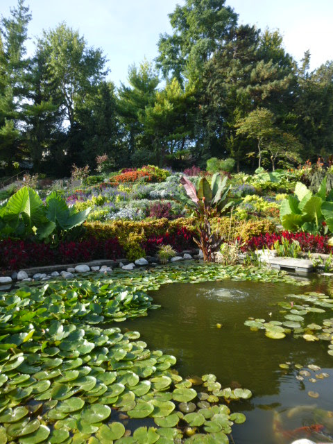
For this month's "Meditations" I am sharing photos that I took at Sunken Gardens in my city of Lincoln, NE, and some inspirational quotes.
Sunken Gardens was developed in 1930 on a landfill site. Men were given jobs to be able to support their families during the Depression. Originally, the design of the gardens was based on mountain scenery from England and incorporated mostly rocked terraces.
In 2004, a major renovation took place. Trees, shrubs, ponds, sprinklers, and a parking lot were added; and later a pavilion and restrooms were installed. Now, employees of the City Parks and Recreation department, along with dozens of volunteers, plant as many as 30,000 annuals using a different theme each year. Sunken Gardens is a popular place for weddings and photo shoots. We are fortunate to have this little gem in our city.
"Mother Nature has the best box of crayons." --Unknown
"Nature's beautiful dancers - flowers, water, leaves
Dancing to the music of God's sweet breeze."
--Terri Guillemets
"Sometimes you just need a break...in a beautiful place...
alone...to figure everything out." --Unkown
"Adopt the pace of nature: her secret is patience."
--Ralph Waldo Emerson
Sharing with: Pieced Pastimes, Share It One More Time, Natasha in Oz, Between Naps on the Porch, Cozy Little House, A Stroll Thru Life, Dwellings the Heart of Your Home, The Dedicated House, Ivy and Elephants, Share Your Cup, A Delightsome Life, French Country Cottage, Shabby Art Boutique
Sunken Gardens was developed in 1930 on a landfill site. Men were given jobs to be able to support their families during the Depression. Originally, the design of the gardens was based on mountain scenery from England and incorporated mostly rocked terraces.
In 2004, a major renovation took place. Trees, shrubs, ponds, sprinklers, and a parking lot were added; and later a pavilion and restrooms were installed. Now, employees of the City Parks and Recreation department, along with dozens of volunteers, plant as many as 30,000 annuals using a different theme each year. Sunken Gardens is a popular place for weddings and photo shoots. We are fortunate to have this little gem in our city.
Dancing to the music of God's sweet breeze."
--Terri Guillemets
alone...to figure everything out." --Unkown
--Ralph Waldo Emerson
Sharing with: Pieced Pastimes, Share It One More Time, Natasha in Oz, Between Naps on the Porch, Cozy Little House, A Stroll Thru Life, Dwellings the Heart of Your Home, The Dedicated House, Ivy and Elephants, Share Your Cup, A Delightsome Life, French Country Cottage, Shabby Art Boutique
Monday, October 12, 2015
Elevate the Look: Desk Chair
This wooden folding chair was cast off and unloved when I found it on sale at an antique shop for $9. It works well with our clean-lined black desk and just needed a little TLC.
I started with some metallic gold paint on the seat, and after taping that off I spray painted the rest of the chair black. When the tape was removed, however, some of the gold came with it. I wasn't sure if the distressed look was good...or not so great.
While tossing that around in my head, I knew that leaving the entire seat gold was going to be too much bling, though. So I needed to decide between black, or ivory to tie in with the cabinets and trim in the room. (I had also considered a pop of aqua or persimmon, but that would have required my incorporating more color into the space, and at this point I don't have the mental energy to go there, haha.) In the end, ivory was the clear winner...black would have looked too "checkerboard", I think.
My husband ended up liking the look of the distressed gold, so I left that alone. Truth be told, I have a habit of rotating things in, out, and through this house often, so it probably isn't worth stressing too much over a $9 chair and a little paint ;) It does look better than it did before, so that's a thumbs up in my book.
Sharing with: Between Naps on the Porch, Dwellings the Heart of Your Home, The Dedicated House, Cozy Little House, A Stroll Thru Life, A Delightsome Life, I Gotta Create, Ivy and Elephants, Houseologie, French Country Cottage, Shabby Art Boutique, My Thrift Store Addiction
Subscribe to:
Posts (Atom)


