Thursday, September 29, 2016

Is Two Pieces of Art a Collection?

There are a couple of different approaches to the way in which we furnish and decorate our homes.  One way is to take a room and select pieces based on a design style or color, or some inspiration from a magazine, Pinterest, etc.  We gather our furnishings, paint colors, and accessories, and we put the room together...voila! 

The other way is to let the room evolve organically over time.  For our personal home, this is my modus operandi.  It drives my hubby crazy; and, I'll confess, it even drives me a little crazy sometimes, haha...partly because it allows time for changing my mind mid-project.  But this organic evolution also nurtures my desire to create spaces that don't follow a predicted style or trend.  I like rooms that tell stories about the people who live in them.


Take, for example, our living room/dining room.  Now, I'll admit that the color scheme has been influenced by what I've noticed online and in magazines.  So, in that regard, it is not really original.  But the eclectic juxtaposition of architectural salvage with contemporary, linear pieces clearly displays my personal design aesthetic.

I rarely commit to conventional "art" for our home.  But once in awhile, something will speak to my heart and I fall head over heels.  That's what happened when I found this top piece at an art festival in Chicago.  (Read more about it here.)

  
After some time, I came across another piece on Etsy that compliments it beautifully.  I knew that the framing needed to be simple in comparison to the ornate, chippy antique frame that I placed the first piece in.  This simple mirrored frame suits the art but doesn't compete.  It's hard to tell in this photo, but these drawings are hung pretty low on the wall.  The bottom edge is only about 2 1/2 feet off the floor.  This small area has a drop ceiling due to duct work.  I hung the first piece at eye level when standing (which is my default position.)  Rather than raising it to accommodate a second piece, I decided I liked the idea of going lower.  When seated, the second piece is at eye level.  It's more interesting than the expected height for art.


These pieces really sing against the dark paint, don't they?  I find ballet to be so breathtaking in its grace, discipline, artistry, and athleticism.  We now have beautiful, original, personal pieces that remind us of a part of our daughter's history.  To me, these are so much more special than anything I could have purchased "off the shelf."

Is two pieces of art a collection?  ;)

Until next time,
Julie


Sharing with: French Country Cottage, Shabby Art Boutique, Between Naps on the Porch, Amaze Me Monday, Inspire Me Monday, A Stroll Thru Life, StoneGable

Thursday, September 22, 2016

A Mixed-Media Art Piece and Her Sisters

"Yes, I am unapologetically girly."

This quote is fun, cute, and appropriate for me...some of the time.  And other times, my style runs quite tailored, even bordering on austere.  That's what makes us women alluring, am I right?

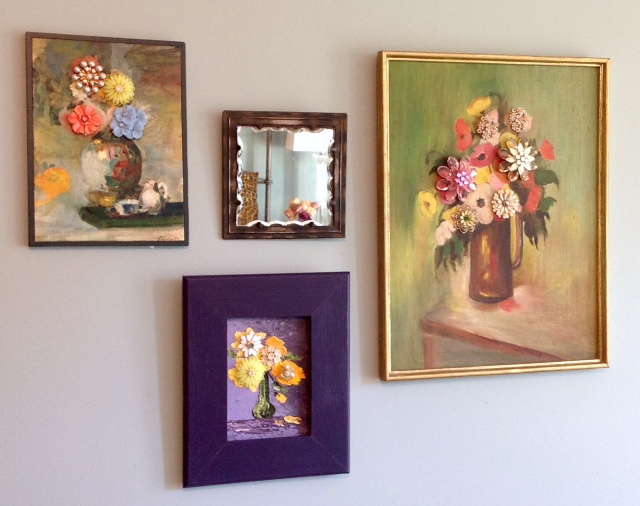
Lately, I am finding so much joy in creating these charming pieces of art; and they are quite "girly."


But they could very easily be combined with other art in a collage that is not so gender-specific.  They would also add a soft, pretty touch to a more neutral-themed space.  After all, the mix is what often gives a room its personality and reflects its dwellers' uniqueness. 

Designing these floral still life pieces all began for me with this one that I wrote about before.  As I mentioned in that post, this gorgeous lithograph caught my eye in a Chicago antique store.  Once I got it home, the creative wheels started turning in my mind, and new delight was unleashed!  


There's just something about vintage jewelry...the sparkle and the nostalgia.  And on this lithograph, it adds dimension and interest and brings out the depth of beautiful colors in the art.  When this piece was complete, I was smitten!  Honestly, though, I considered this a one-of-a-kind item (well, it is that.)  But I hadn't planned to create more of these.  And then, I stumbled upon this piece while antique-shopping...


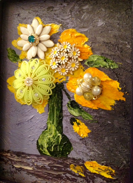
This time, I knew exactly what to do :)  The deep purple background lent direction to how I would finish it.  In this case, I decided to go bold and a bit more contemporary by using a wide, clean-lined frame and painting it.  


The jewelry I used for embellishment is a cheerful mix of shapes in yellow, green, and white hues.  This one is a small original oil painting, and you can see the layering and thickness of paint that was used.  It just radiates happiness, don't you agree?

Sooooo, what can I say about this next piece?


One more time, while browsing in an antique store (this time during a fun weekend in Des Moines as I attended a blogging conference) "she" spoke to me.  The retro vibes and lively colors of this pretty painting easily sold me.


I decided that the existing simple gold frame was perfect, and I left it alone.  I had some bold crystal brooches in pink and yellow that fit the scale of this larger piece.  From there, I played with shape and texture when adding more jewelry.


What do you think?  Would you use these in a collage?  Or hang them to make a unique statement on their own?

You can find this "Mixed-Media Art Piece and Her Sisters" in my Etsy shop:  RMDesignLoft 
Have a great week, Friends!

Julie


Sharing with: Thoughts of Home on Thursday, Vintage Charm, French Country Cottage, Shabby Art Boutique  , I Gotta Create, Between Naps on the Porch, StoneGable, A Stroll Thru Life, Domestically Speaking


Thursday, September 15, 2016

Whispers of Autumn Decor

Remember when Fall decor was entirely composed of orange, red, brown, acorns, mums, and maple leaves? Then came white pumpkins with a trend toward neutral decor, followed by heirloom pumpkins in every shade of the rainbow. When dressing your home for autumn, accessories run the gamut from traditional to trendy.

I love working a seasonal feel into our rooms and have tried many different styles throughout the years. This fall, I'm going with a somewhat minimal approach and am staying true to my love of greens and teals, along with texture and some deep neutral tones.


On our dining room table, I've arranged faux olive branches and autumn-toned gold branches in a vintage teal vase. Next to a metallic bronze pumpkin and sleek acrylic & antique brass candlesticks, this creates a classic and pretty centerpiece.


If you follow me on Instagram, you've seen this arrangement of twisty, moss-covered branches with green glass Chinese lanterns in a thrift-store vase. The antique gold frame creates a nice "picture" of the vignette that sits atop our glass-door display hutch.


In this same area of our living/dining rooms, I created an arrangement with hydrangeas, lamb's ear, hosta leaves & hosta flower stems from the yard. Use what you can from your own yard, even when combined with purchased flowers! The vase is clear with food coloring added to the water to coordinate with our room's color scheme. (Haha, the inner workings of a designer's mind...)


This gold and bronze acorn echoes the shape and texture of a wooden finial that sits on an old book with a teal and gold cover.


Moving into our family room, you see that the mantel display is quite "clean" and minimal. I like what I had put together for its summer look and simply switched a wire cloche with my gold antelope. Aren't these fun with their long, exotic legs and horns? They were a fantastic garage sale score, and I'm told that they traveled here from Africa! I think they are happily at home now in Nebraska :)


The throw pillows and tabletop arrangement carry the teal/green scheme from other areas of our first floor. And zebra print is season-less, don't you agree?


Of course, you knew that I'd be switching up my favorite wall vases for fall, right? I've had more fun arranging these with the changing seasons...and occasional aggravation getting them to look just right, haha. The natural colors and textures of thistle, fern, and pheasant feathers seemed like the perfect mix this year.


For me, this subtle look is just enough to usher in the crisp days of autumn. Are you enjoying the transition to cozier time indoors that is around the corner?


Thanks for your visit,
Julie


Sharing with: Vintage Charm, The Charm of Home, French Country Cottage, Shabby Art Boutique, Between Naps on the Porch, Amaze Me Monday, StoneGable, A Stroll Thru Life, Domestically Speaking

Tuesday, September 6, 2016

#sunporchgoals

Summer is quickly slipping away...sigh. Did you get to do all of the fun things on your list? We didn't have an extensive list of want-to-do's this year, as we were busy updating rental properties and our basement. Luckily, I have a couple of trips scheduled for this fall, so I won't have to feel too sorry for myself ;)

One of the things I really want to fit in before cold weather sets in, though, is to spend some time relaxing on our sun porch. In the heat of the summer, it's just too hot out there; and in the winter, it's definitely not an option! But, when the weather is pleasant, the sun porch is like an oasis where we can enjoy the sights and sounds of the seasons and nice cross-breezes wafting through the windows. It's my favorite spot for reading a good book or thumbing through a magazine (if I can stay awake long enough, haha.)

The furnishings we currently have on the sun porch are really comfortable, but they're dated and pretty worn out. I've been dreaming up a design scheme for this space with new furniture, accessories, and lighting in the hopes that very soon we can do a refresh out here. I'd love to create a higher-end look with more substantial pieces. Here is a peek at the current situation:


And here is my vision for the new design:


The color scheme would pretty much remain the same...neutral upholstered pieces, green accents, and black, iron, and wood finishes. I'd add a little teal to tie in with the rooms indoors, which are accessed through French doors and can be seen from out here. In my fantasy space, I've combined outdoor furnishings from Arhaus with accessories and decor from various sources. These furniture pieces would weather much better than what is out here now, none of which was designed for harsh sun or extreme temperature fluctuations. And they look so much more sophisticated, don't they? I took a less-is-more approach with accessories and décor in the new design...again, it lends itself to a higher-end feel.

If you'd like to shop this look, here is a list of resources:

Arhaus: Spinnaker Outdoor Slipcovered Chaise in Sail Sailor, Spinnaker Outdoor Slipcovered Swivel Chair in Sail Sailor, Crete Outdoor 26" End Table, Bordeaux Outdoor Reconstructed Stone End Table, Reeve Outdoor Large Lantern, Balor Table Lamp, Iron Console Table
Crate and Barrel Dundee Floor Planter
Wayfair H. Potter Rectangular Terrarium
Artcraft Lighting AC10015 Castello Chandelier
Joss & Main Hudson Indoor/Outdoor Rug
Frontgate Tangier Stripe Lagoon Outdoor Pillow (green, on chaise)
Houzz Indoor-Outdoor Pillows (patterned teal/green on chaise)
Zazzle.com Simple Green Leather Texture Print Black Frame Outdoor Pillow (monogram)

I'm planning to do some relaxing out here and fantasizing about this new look over the long weekend. I hope you enjoy these late summer days before they slip away, Friends.
Julie


I was not compensated for writing this post. The opinions are completely my own.