Are you feeling the Fall vibes yet? The weather has been very fickle here in the Midwest...one day it's 90 degrees and the next, it's 55! It seems that Mother Nature is having some serious mood swings this year.
But everywhere you look, the season's wares abound. Sweaters and boots are appearing in the stores, Fall decor overflows in craft and gift shops, and pumpkin-spice drinks are being served in coffee shops all around.
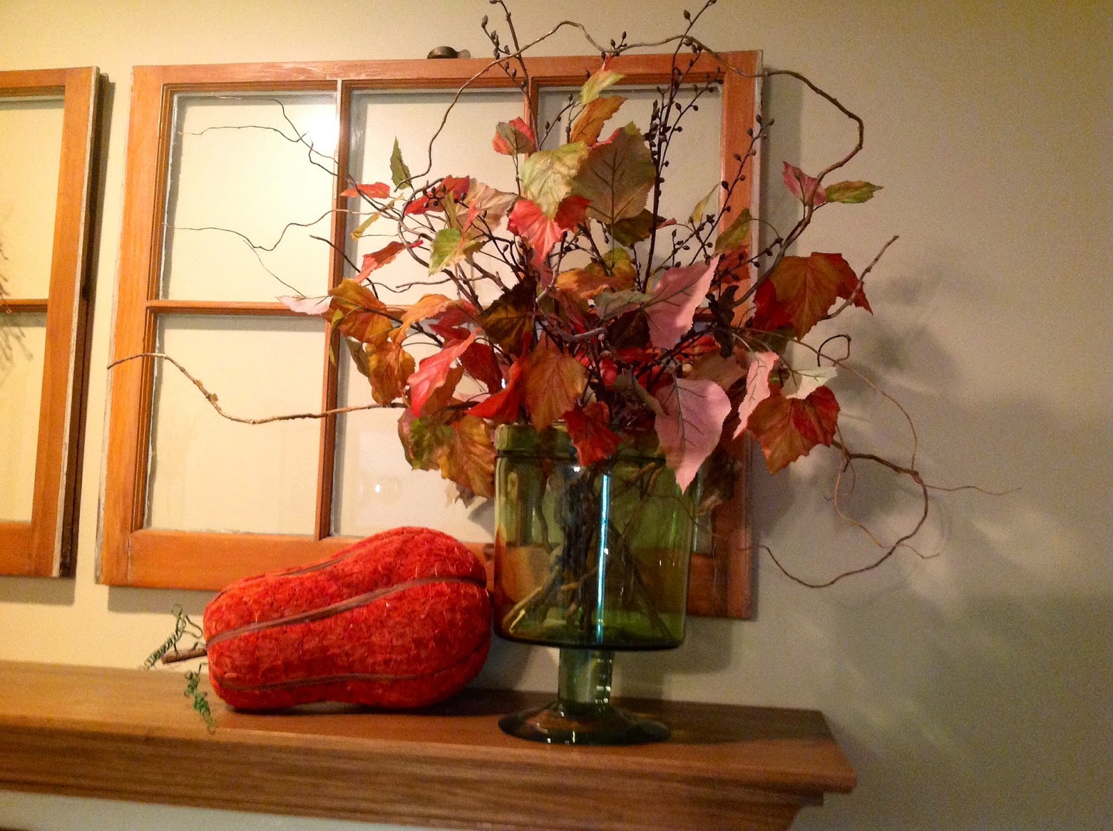
This year, I stayed with a fairly conventional approach in decorating my family room mantel, using orange pumpkins, gourds and leaves. But for the rest of my seasonal decor, I took a more subtle approach.
In the living/dining area, where the color scheme is neutrals with green, I interjected metallic pumpkins, pinecones, and hydrangeas into my vignettes.
Here, you can see that I created a centerpiece using vertical shapes - finials and faux thistle in a wire cloche. Varying heights, shapes and textures give visual interest where bright colors are absent. Soft green hydrangeas from my garden and faux gourds invoke a seasonal feeling.
On the coffee table, a shining metallic pumpkin rests on a bed of dried beans and peas to further the theme of texture and quiet color. Greenery adds interest and movement, while large pinecones compliment the bronze color of the pumpkin. The silver crown is one of my favorite accessories and often travels from place to place in our home. I enjoy the juxtaposition of shiny metallics with heavy texture for lots of visual appeal.
Another favorite accent, this hand holds a glittery green pumpkin for Fall this year. I love the whimsy it adds to every season when a special item is placed in its palm.
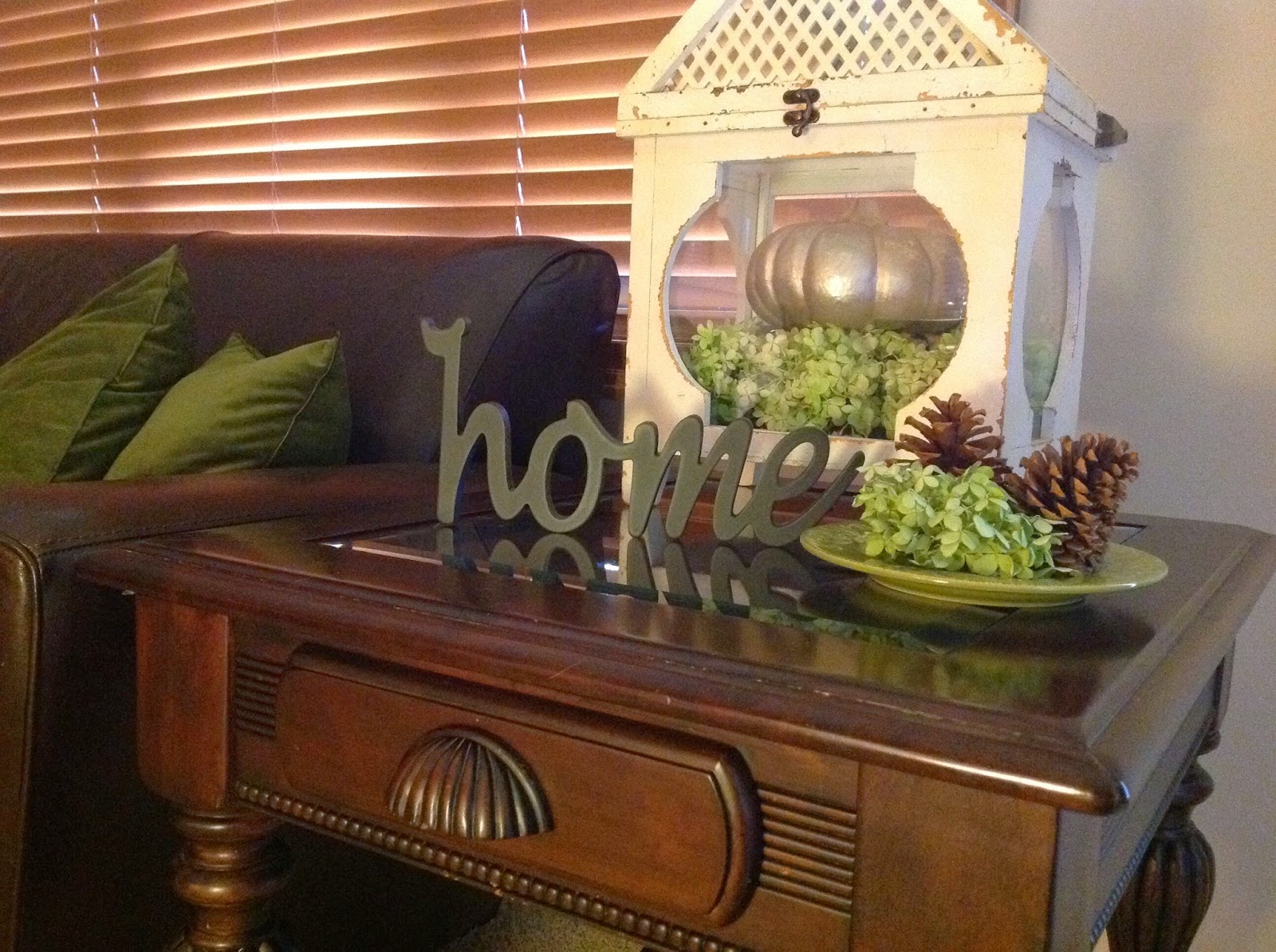
A greenhouse continues the room's subtle seasonal story as it shows off more gorgeous hydrangeas and a silver pumpkin. Our hydrangea bush has been very generous this year, and I am reaping the rewards in my Fall decorating. More pinecones echo the texture of the tabletop, and the "home" message adds a cozy touch.
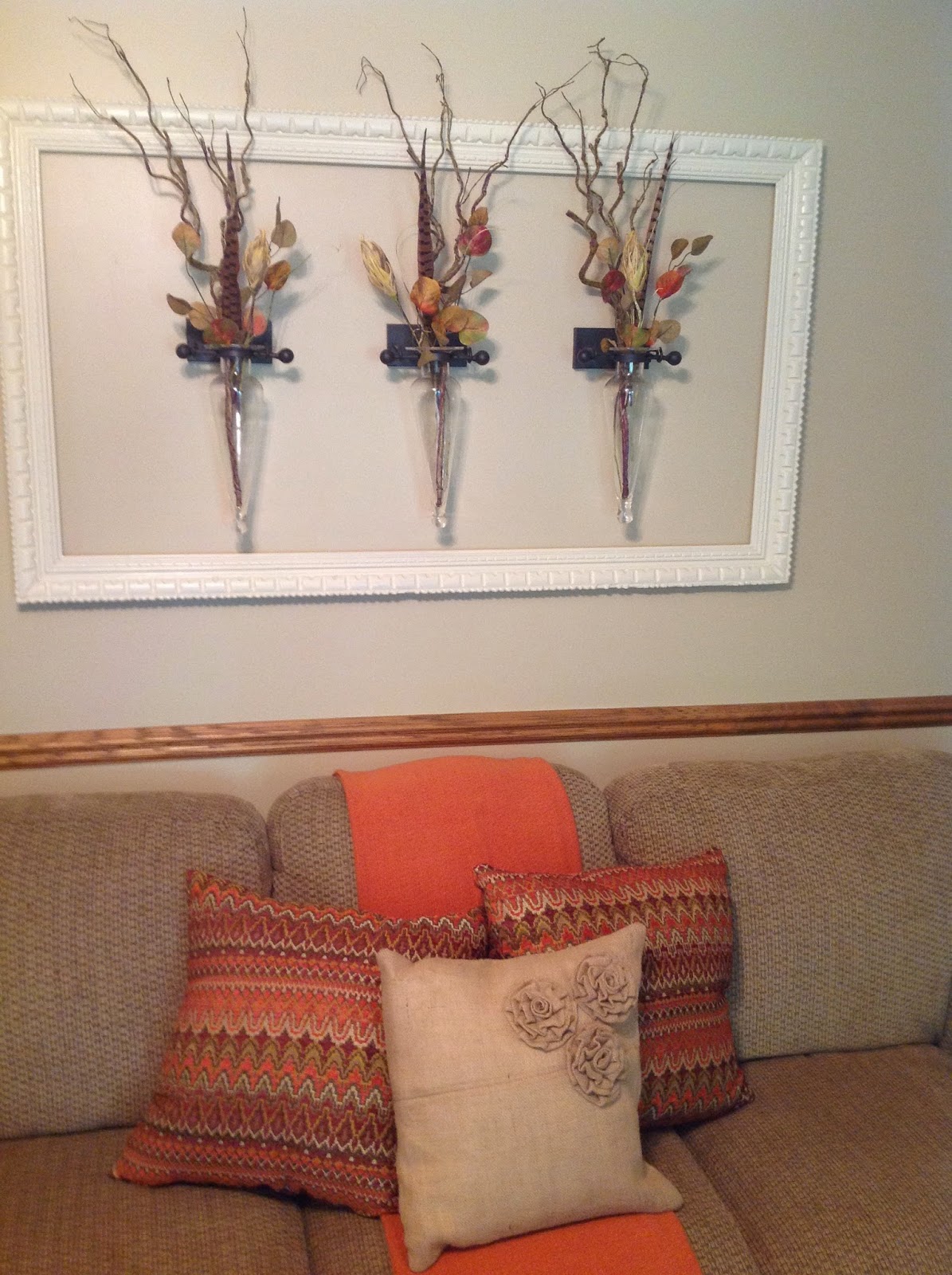
Back in our family room, where orange is in the spotlight, the wall vases are dressed sparingly with pheasant feathers, branches and faux flower pods.
And I have to add one more photo of the mantel in here because I brought in some gold gazelles and just needed to show them off.
It's almost time to light some apple- and cinnamon-scented candles and get cozy...it won't be long until the nights are chilly and the air is crisp.
Sharing with Houseologie, Dwellings The Heart of Your Home, Distressed Donna Down Home, Rustic & Refined, Between Naps on the Porch, The Dedicated House, Cozy Little House, Coastal Charm, My Uncommon Slice of Suburbia, Cedar Hill Farmhouse, A Stroll Thru Life, Ivy and Elephants, Share Your Cup, Shabby Art Boutique, French Country Cottage, Nancherrow, The Charm of Home, Fine Craft Guild, New House New Home New Life, Simple Details
Sunday, September 14, 2014
Wednesday, September 10, 2014
Bigger is Better
Often, the best things come in small packages, as the saying goes.
But there are definite instances where bigger really is better. Take interior design, for example.
There is a mistake that I repeatedly make when purchasing home accessories, and I wonder if any of you do the same? I tend to buy small items...too small to make much of an impression. This habit most likely developed because I am frugal to a fault. It's true...I have a hard time parting with my money! Consequently, Tammy Tightwad (yours truly) ends up buying lots of modestly-priced, small accessories. The problem this has created is that my home lacks the visual impact that a few larger, statement pieces would create.
The first step in changing an undesirable habit is recognizing it, right?
Alrighty then...Step One...check!
Step Two would logically be to keep my goals in mind while shopping, and resist that old urge to look only at the small, inexpensive pieces.
If you follow my blog, you know that I really enjoy a good estate or tag sale. It just so happens that I recently scored this wall plaque (above) at an estate sale for $8. OK, I know what you're thinking...$8 is still inexpensive! But stick with me for a minute... As with most of the pieces I pick up, I take them home without a solid vision of where they will go. I shop with my heart, not my head. Yes, it's true..."Impulse" is my middle name.
Tammy Impulse Tightwad.........mmmmm hmmmm.
This time, though, as I carried that wall plaque through my house, considering the options, I made a happy discovery. The plaque is very similar in style to the one I had made and hung in our master bath. Except the new one looks SO much better. See the difference? It's bigger, brighter, and fills the space...perfect!
I'd love to be able to say that this was orchestrated by the "bigger is better" plan, but honestly it just happened.
At any rate, I'm working on training my eye to shop for more dramatic home accessories from now on. Is anyone with me on my mission?
But there are definite instances where bigger really is better. Take interior design, for example.
There is a mistake that I repeatedly make when purchasing home accessories, and I wonder if any of you do the same? I tend to buy small items...too small to make much of an impression. This habit most likely developed because I am frugal to a fault. It's true...I have a hard time parting with my money! Consequently, Tammy Tightwad (yours truly) ends up buying lots of modestly-priced, small accessories. The problem this has created is that my home lacks the visual impact that a few larger, statement pieces would create.
The first step in changing an undesirable habit is recognizing it, right?
Alrighty then...Step One...check!
Step Two would logically be to keep my goals in mind while shopping, and resist that old urge to look only at the small, inexpensive pieces.
If you follow my blog, you know that I really enjoy a good estate or tag sale. It just so happens that I recently scored this wall plaque (above) at an estate sale for $8. OK, I know what you're thinking...$8 is still inexpensive! But stick with me for a minute... As with most of the pieces I pick up, I take them home without a solid vision of where they will go. I shop with my heart, not my head. Yes, it's true..."Impulse" is my middle name.
Tammy Impulse Tightwad.........mmmmm hmmmm.
This time, though, as I carried that wall plaque through my house, considering the options, I made a happy discovery. The plaque is very similar in style to the one I had made and hung in our master bath. Except the new one looks SO much better. See the difference? It's bigger, brighter, and fills the space...perfect!
I'd love to be able to say that this was orchestrated by the "bigger is better" plan, but honestly it just happened.
At any rate, I'm working on training my eye to shop for more dramatic home accessories from now on. Is anyone with me on my mission?
Wednesday, September 3, 2014
Fall Color on the Mantel
Where did summer go?
I recently read a tip from Sarah Ban Breathnach, in her book "Simple Abundance", that suggested that you write a list of all of the things you wanted to do over the summer but didn't accomplish. Then you are to save the list and open it on the first day of next June and make the postponed-items a priority.
Well, I would need an entire journal for my list! Seriously, I don't feel like summer even came this year...
We didn't take a vacation, or even a stay-cation...we hardly ate any grilled foods, melon, or corn on the cob...and I didn't put a bathing suit on once! How sad is all of that? (OK, maybe I'm not that sad about the bathing suit part, haha.)
And here we are in September already!
But the good news is that Fall is probably my favorite decorating season, so I decided to quit crying over spilled lemonade and get a start on re-fluffing the house over the long weekend.
The fireplace mantel in our hearth room is usually one of the first spots I decorate in our home. I often like to use an asymmetrical design because it tends to be a bit more casual and non-traditional. I decided to go with one wreath rather than two (sometimes I hang one on each window.) This twig wreath was one I had made last year, but I added a few orange berries to punch up the color just a bit.
The wreath's height was balanced by using an urn filled with long stems of leaves and branches.
This piece of art was bought at a local consignment shop last year. I like its masculine feel and dark-edged frame and matting. (At first, I wasn't a fan of the shape of the mat board...I felt like it was trying too hard or something, and I considered changing it. But I think it might be growing on me.)
The faux pumpkin and large faux gourd bring out the pretty seasonal orange tones, and the spray of leaves and berries add some texture and deeper reds. And speaking of texture, this large pinecone really echoes the masculine feel of the artwork and the smaller pinecones in the wreath above it.
Now that the mantel is dressed for the season, I'm ready to move on to the living room and front porch.
Happy decorating, everyone!
Sharing with Ivy & Elephants, City Farmhouse, DIY by Design, Paper & Fox, Addicted 2 DIY, The Charm of Home, Nancherrow, French Country Cottage, Shabby Art Boutique, At the Picket Fence, Natasha in Oz, Pieced Pastimes, Vintage Paint and More, Dwellings The Heart of Your Home, The Journey Back, Domestically Speaking, Cozy Little House, A Stroll Thru Life, Confessions of a Plate Addict, The Dedicated House
I recently read a tip from Sarah Ban Breathnach, in her book "Simple Abundance", that suggested that you write a list of all of the things you wanted to do over the summer but didn't accomplish. Then you are to save the list and open it on the first day of next June and make the postponed-items a priority.
Well, I would need an entire journal for my list! Seriously, I don't feel like summer even came this year...
We didn't take a vacation, or even a stay-cation...we hardly ate any grilled foods, melon, or corn on the cob...and I didn't put a bathing suit on once! How sad is all of that? (OK, maybe I'm not that sad about the bathing suit part, haha.)
And here we are in September already!
But the good news is that Fall is probably my favorite decorating season, so I decided to quit crying over spilled lemonade and get a start on re-fluffing the house over the long weekend.
The fireplace mantel in our hearth room is usually one of the first spots I decorate in our home. I often like to use an asymmetrical design because it tends to be a bit more casual and non-traditional. I decided to go with one wreath rather than two (sometimes I hang one on each window.) This twig wreath was one I had made last year, but I added a few orange berries to punch up the color just a bit.
The wreath's height was balanced by using an urn filled with long stems of leaves and branches.
This piece of art was bought at a local consignment shop last year. I like its masculine feel and dark-edged frame and matting. (At first, I wasn't a fan of the shape of the mat board...I felt like it was trying too hard or something, and I considered changing it. But I think it might be growing on me.)
The faux pumpkin and large faux gourd bring out the pretty seasonal orange tones, and the spray of leaves and berries add some texture and deeper reds. And speaking of texture, this large pinecone really echoes the masculine feel of the artwork and the smaller pinecones in the wreath above it.
Now that the mantel is dressed for the season, I'm ready to move on to the living room and front porch.
Happy decorating, everyone!
Sharing with Ivy & Elephants, City Farmhouse, DIY by Design, Paper & Fox, Addicted 2 DIY, The Charm of Home, Nancherrow, French Country Cottage, Shabby Art Boutique, At the Picket Fence, Natasha in Oz, Pieced Pastimes, Vintage Paint and More, Dwellings The Heart of Your Home, The Journey Back, Domestically Speaking, Cozy Little House, A Stroll Thru Life, Confessions of a Plate Addict, The Dedicated House
Sunday, August 24, 2014
Enhancing the Entryway
Have any of you ever fallen into the (sometimes-false) train of thought that you should paint a small, dark area in a light color? Well, that's exactly what I had done in my very small, very dark entryway. I painted everything white, thinking that would be the solution. And it stayed white for almost 10 years.
Yes, it was lighter, that's true. But, oh my, it was still SO boring...and sad. So I did some brainstorming. Since our entryway opens to our living room where the color scheme is neutrals with pops of green, I decided to go bold and paint the front door green (and believe me, this is not a quiet shade of green.) Actually, the outside of the door is already a bright, fun green, so why not paint both sides the same color? Brilliant! And NOT boring ;)
I took some inspiration from one of my favorite bloggers. Jennifer at Dimples and Tangles has infused her home with beauty, personality and color (including some gorgeous shades of jade and emerald. Check out the dining room hutch in her home tour!)
Because my door was white, I had to apply several coats of paint to cover it. (OK, it took 5 coats...but who's counting?) And now I am loving this choice! What a difference it has made in elevating the personality of the space.
Well, I couldn't just stop there, right? I also decided to zhuzh-up the little vignette on our stairway landing. I moved a photo of our favorite dancer ;) and replaced it with a frame that had been gathering dust in a closet. Since I believe that every area of the house benefits from the natural color and texture of greenery, a wreath seemed to be the perfect addition to the frame. See how it breathes life into the hard surfaces?
And I brought in some hydrangeas from the garden. They will look even better as they start to dry and wear their Autumn colors. Even though it is still as hot as ever here in the Midwest, I pulled out my gilded acorns in anticipation of cooler months ahead.
This tray was a Homegoods gem that I snatched up as soon as I laid my eyes on it. It will likely move from room to room in our house, as it will work well in so many settings. The fleur de lis finial was a tag sale find and will also relocate in time, no doubt.
The candle sconce has been with us for at least 12 or 15 years. When I bought it, I thought it was really artsy and chic. I guess I'm still not ready to part with it. And the greyhound sculpture...well, what can I say? Do other dog owners buy replicas of their "best friends" too? I just couldn't resist when I spotted it in an antique shop. It was probably over-priced, but as a greyhound mom, I just had to have it!
I'm pleased with this area so far. But you know how one project almost inevitably leads to another?
Yeah, so stay tuned for more entryway updates...as soon as my husband gets over the shock of this new door color!
Sharing with A Delightsome Life, Between Naps on the Porch, StoneGable, A Stroll Thru Life, Cozy Little House, Coastal Charm, Domestically Speaking, Upcycled Treasures, Elizabeth & Co, Lamberts Lately, Share Your Cup Thursday, Ivy and Elephants, Life in Velvet, The Charm of Home, Nancherrow, Shabby Art Boutique, Redoux Interiors, French Country Cottage, Simple Details, Natasha in Oz,
Yes, it was lighter, that's true. But, oh my, it was still SO boring...and sad. So I did some brainstorming. Since our entryway opens to our living room where the color scheme is neutrals with pops of green, I decided to go bold and paint the front door green (and believe me, this is not a quiet shade of green.) Actually, the outside of the door is already a bright, fun green, so why not paint both sides the same color? Brilliant! And NOT boring ;)
I took some inspiration from one of my favorite bloggers. Jennifer at Dimples and Tangles has infused her home with beauty, personality and color (including some gorgeous shades of jade and emerald. Check out the dining room hutch in her home tour!)
Because my door was white, I had to apply several coats of paint to cover it. (OK, it took 5 coats...but who's counting?) And now I am loving this choice! What a difference it has made in elevating the personality of the space.
Well, I couldn't just stop there, right? I also decided to zhuzh-up the little vignette on our stairway landing. I moved a photo of our favorite dancer ;) and replaced it with a frame that had been gathering dust in a closet. Since I believe that every area of the house benefits from the natural color and texture of greenery, a wreath seemed to be the perfect addition to the frame. See how it breathes life into the hard surfaces?
And I brought in some hydrangeas from the garden. They will look even better as they start to dry and wear their Autumn colors. Even though it is still as hot as ever here in the Midwest, I pulled out my gilded acorns in anticipation of cooler months ahead.
This tray was a Homegoods gem that I snatched up as soon as I laid my eyes on it. It will likely move from room to room in our house, as it will work well in so many settings. The fleur de lis finial was a tag sale find and will also relocate in time, no doubt.
The candle sconce has been with us for at least 12 or 15 years. When I bought it, I thought it was really artsy and chic. I guess I'm still not ready to part with it. And the greyhound sculpture...well, what can I say? Do other dog owners buy replicas of their "best friends" too? I just couldn't resist when I spotted it in an antique shop. It was probably over-priced, but as a greyhound mom, I just had to have it!
I'm pleased with this area so far. But you know how one project almost inevitably leads to another?
Yeah, so stay tuned for more entryway updates...as soon as my husband gets over the shock of this new door color!
Sharing with A Delightsome Life, Between Naps on the Porch, StoneGable, A Stroll Thru Life, Cozy Little House, Coastal Charm, Domestically Speaking, Upcycled Treasures, Elizabeth & Co, Lamberts Lately, Share Your Cup Thursday, Ivy and Elephants, Life in Velvet, The Charm of Home, Nancherrow, Shabby Art Boutique, Redoux Interiors, French Country Cottage, Simple Details, Natasha in Oz,
Subscribe to:
Posts (Atom)